- UX/UI Design,
- Design System,
- MedTech
About the project
Mentice develops simulation solutions for endovascular therapy, used by hospitals, medtech companies and pharmaceutical firms around the world. Ankyras is their clinical decision-support application for neurovascular care: a tool that provides detailed anatomical insights and lets the physician simulate the placement of a flow diverter to assess the right device size and position before a brain aneurysm is treated. Mentice had produced a new version of the product with mock-ups that were already close to right in terms of flow and overall UX, but that needed professional UX/UI design to be finished. Our assignment was to complete and quality-assure the interface ahead of the handover to development, with the precision required of a regulated medical tool and with an audience of specialist physicians in mind.
A flow that shows where you are
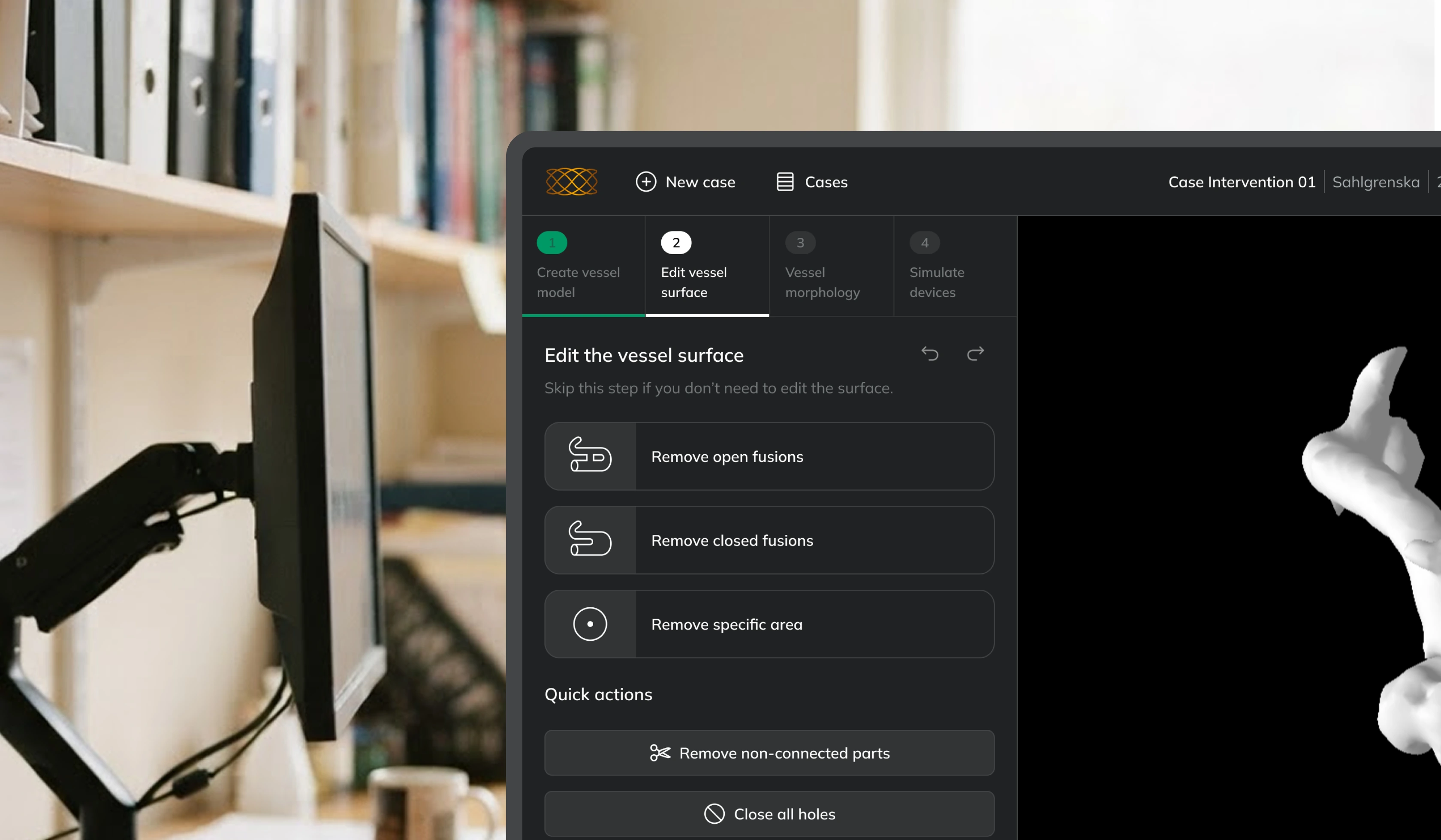
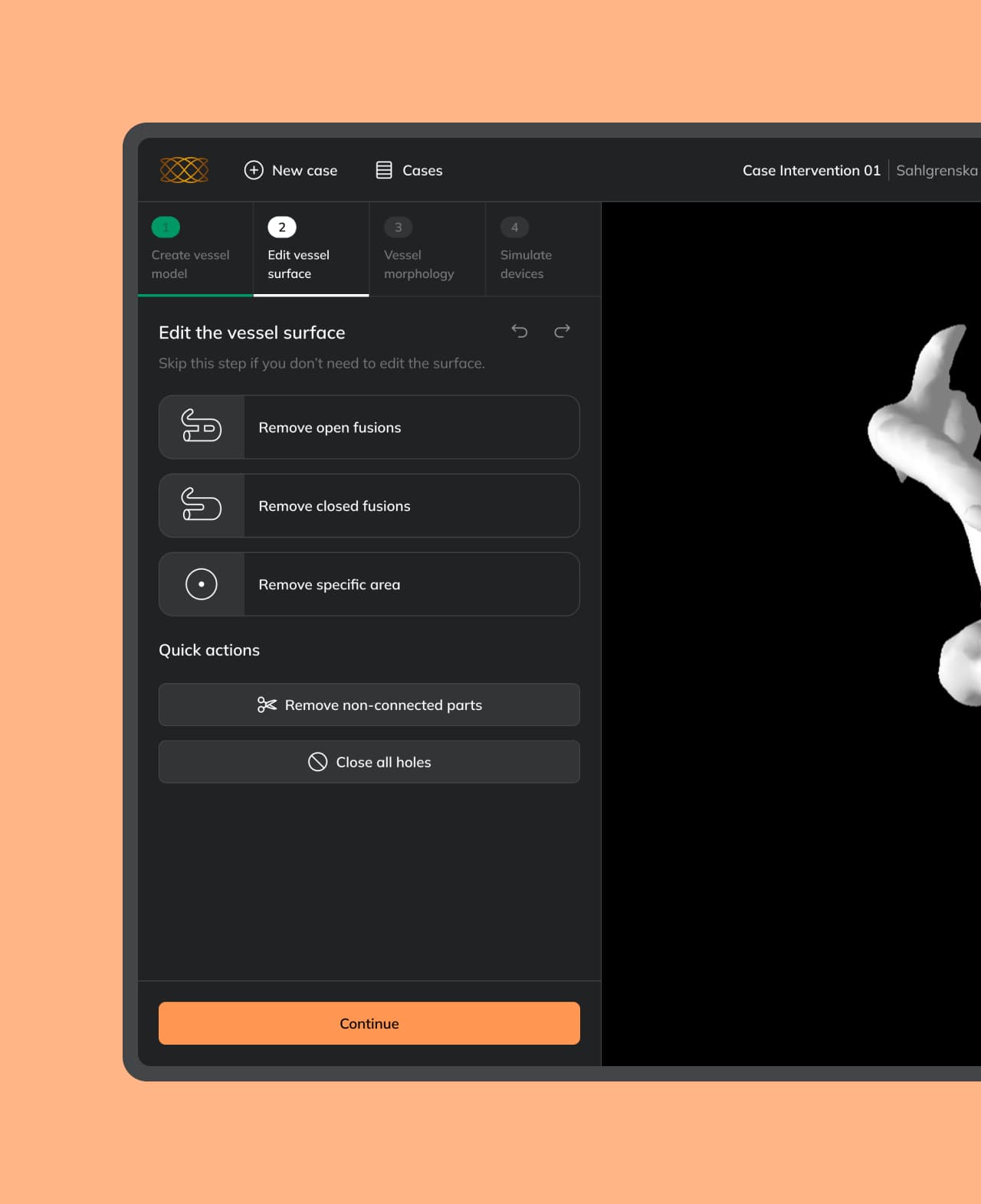
Preparing a case in Ankyras follows a set order. The vessel model is created, the surface is adjusted, the morphology is measured, and only then can stents and flow diverters be simulated. We made that order visible with a step indicator, the same pattern users recognise from checkout flows and longer forms in other systems.
The four tasks were numbered and each given a state: done, in progress, and not yet available. Each step also gained a heading and a sentence saying what to do, rather than a toolbox to interpret. For accessibility the state is coded by number, colour and underline together, so it comes across even to someone who does not perceive the colour difference.

Editing next to the model
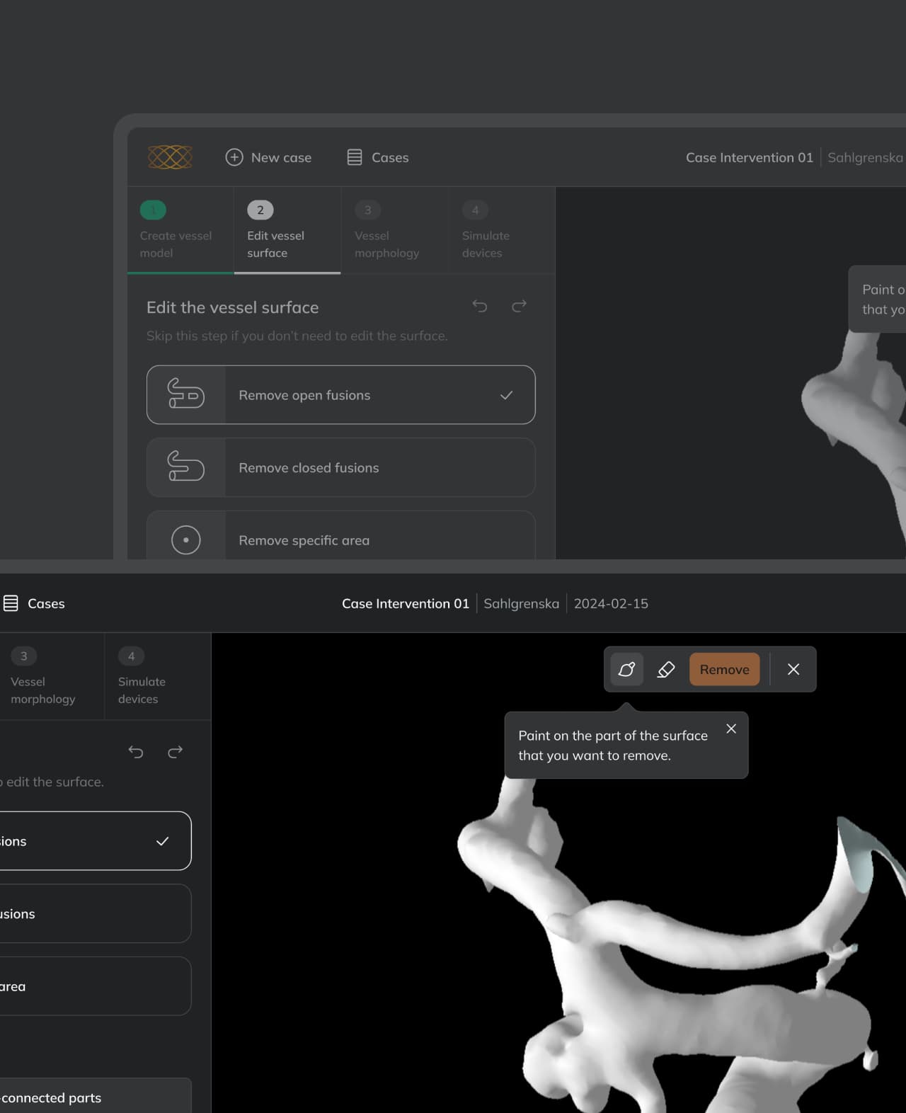
Another place in the flow we improved is the manual editing of the vessel surface. Here the user works directly on the 3D model, so we did not leave the tool in the side panel along with everything else. We put it in the view, next to the model being changed. The reason is the distance between where you are looking and where the tool sits. Placed in a panel to one side, the task is split across two places, one where you choose and one where you see the result. With the toolbar in the view, both happen in the same place, in the context where the action is carried out.
The editing itself is supported by three things. A tooltip explains what to do the first time someone enters the mode. What you mark is coloured before it is removed, so the selection stays visible while you can still change your mind. And once the action has gone through, the system confirms it, because a small change in a 3D model is otherwise easy to miss.
A design system adapted for Unity
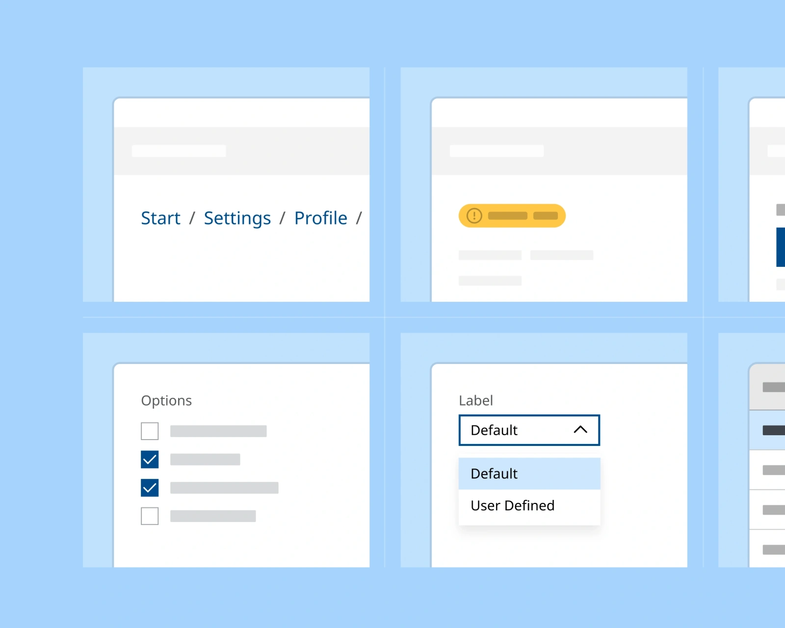
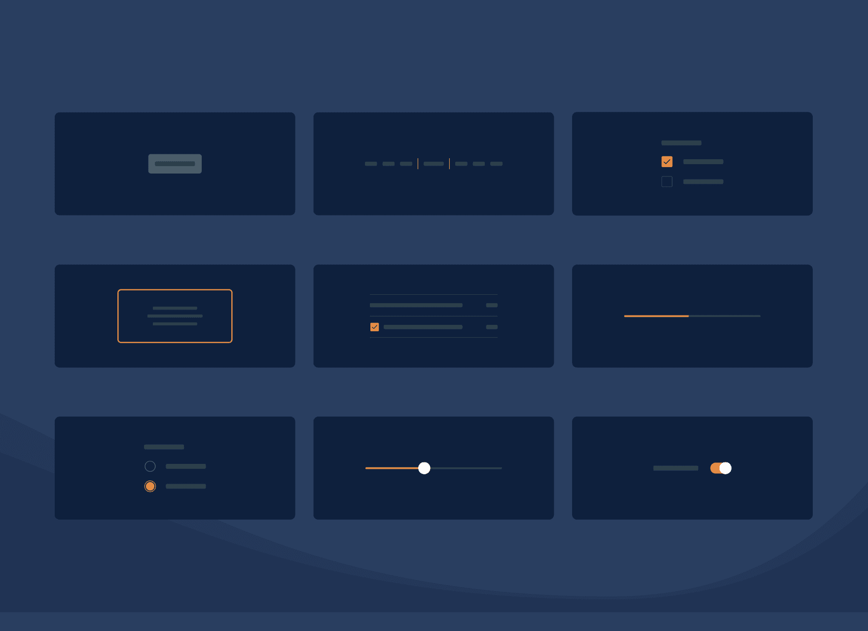
Mentice already had a design system we had built for them. We reviewed and updated it in Figma so that it covers everything Ankyras needs, from colour, typography and iconography to buttons, drop-downs, tabs and input fields.
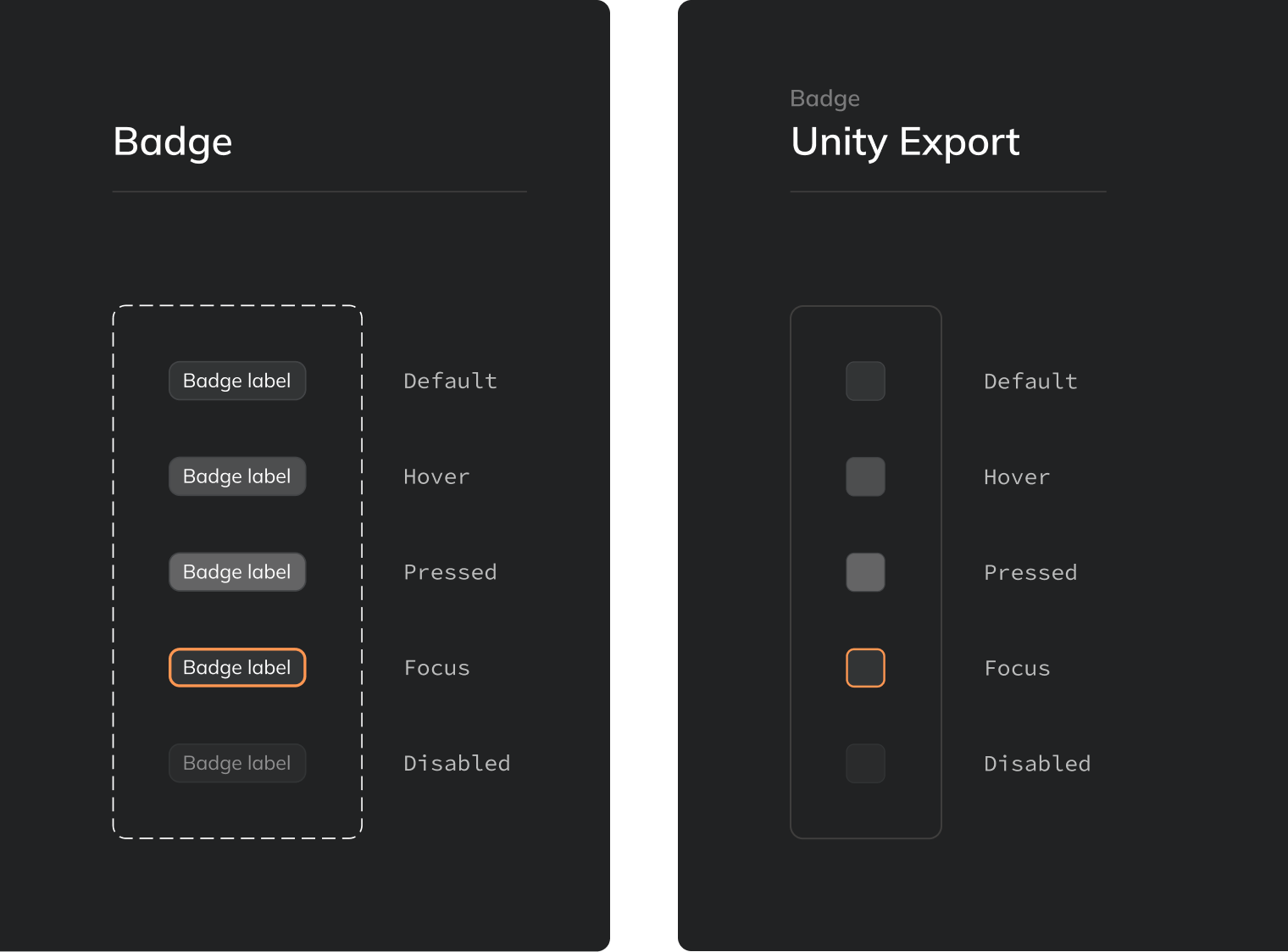
The Ankyras interface is built in Unity, so every component also got an export set for Unity, with graphics per state built from the same variables as the design components. The developer pulls it straight into Unity without reinterpreting the design.
Key takeaways
A clinical decision-support tool places different demands on design than a consumer product. Its users are specialists making decisions with serious consequences, often under time pressure, and the interface has to be understandable without explanation. We therefore chose to solve as much as possible with established patterns rather than novel ideas, and to put our effort into hierarchy, states and consistency rather than new functionality.
Words from the client
❝ Since the launch of the new version of Ankyras in Europe, which Intunio helped us design, we have received very positive feedback on the interface. Users find it much better and easier to use than the previous version. We also learned a great deal from working with Intunio and now have a much better way of thinking about UI design.
Martina Andreasson
Product Marketing Manager, Mentice AB
Do you like what we do?
Don't hesitate to share your next idea with us. We'd love to learn more about you and what we can create together.