Branding and visual identity — for digital products and design systems
Intunio does branding for tech companies and industry — visual identity, design systems, and brand-os that hold up over time.
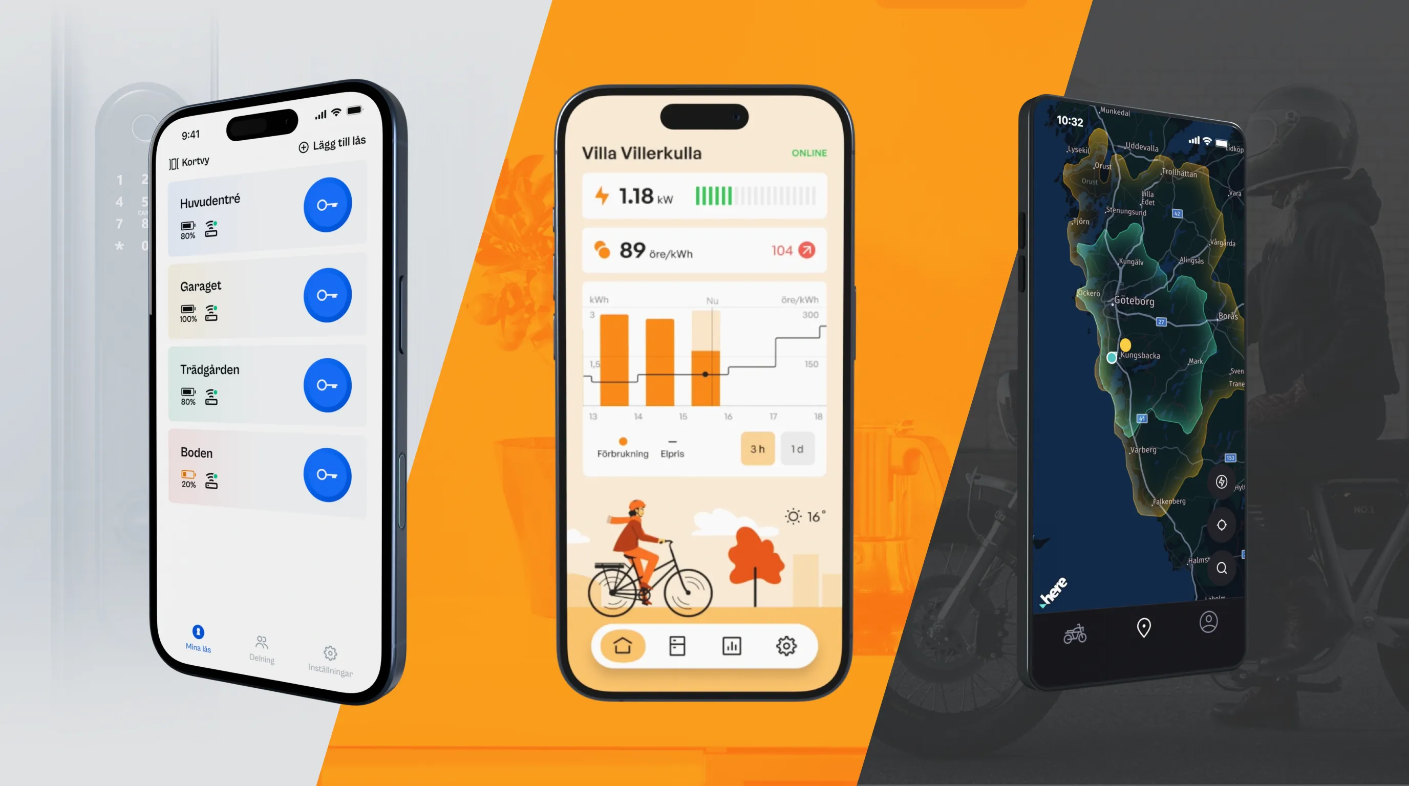
Intunio is a design and development studio in Gothenburg, building visual identity for digital products. Logo, colour palette, typography, and motion are designed to carry through to the design system, app, and web — not just to a guidelines document.
At Intunio we see branding as part of the product design, not as a separate workstream owned by the communications team. The brand is how the product looks and behaves every day, not how the company is presented in a pitch deck. That means identity is built to work in the interfaces where users actually meet it.
We work both on entirely new brands and on updates to existing identities. The scope typically covers logo and brand foundation, colour and typography systems translated to design tokens, motion principles, and the material needed for pitch, website, and product.

What we do
Logo and brand foundation: wordmark, symbol, brandmark, and principles for how they're used in digital and physical contexts
Colour palette as design tokens: a colour system that works both for the marketing site and the product, including accessibility fundamentals (contrasts, theming)
Typography: typeface selection and a typographic system with scales that work from small UI elements to large headings
Motion principles: how the brand moves, from logo animations to transitions and microinteractions in the product
Design system foundation built on the identity: tokens and core components that translate visual identity into product design
Pitch and presentation material: keynote/pitch templates, sales presentations, investor material that follow the identity
Living guidelines: documentation where examples come from real products, not abstract moodboards
Common audiences are startups going to market, platform companies that need a new identity, and established companies launching a digital product that should feel like the brand.
Branding as part of the product, not alongside it
At Intunio, the brand is a core component of the user experience, not a screen shown before the user starts using the product. Colour, typography, and motion are the same in the app, on the site, and in the design system — expressed as design tokens that live in the code.
That means an identity update is a token update. When the brand's primary colour changes, every surface updates automatically. When the typeface changes, it's built into the same system. That's a completely different rhythm from traditional branding where guidelines are sent to each team to interpret separately.
It's also why we rarely deliver branding as a separate stream. Identity is best built alongside the design system and product design, so it actually lives in the surfaces users meet.
Is this the right service for us?
This service fits when the brand needs to be delivered to digital products — app, web, design system — and serve as a foundation for development, not just as guidelines.
For pure communications and advertising work, large-scale print, or TV and OOH campaigns, an advertising agency is often better suited. We make pitch and presentation material that follows the identity, but not campaign production.
The two are not mutually exclusive. Many clients start with us for digital identity and add an ad agency for campaigns. The important thing is that the digital identity stays consistent — it meets users every day.
How we work in a branding engagement
Four phases:
Workshop and positioning
We start with positioning: who you're for, what sets you apart, how you want to sound. The result is a shared picture of the brand as direction for the visual work. For clients who already have a brand platform, we move faster here.
Visual concepts
We produce two or three directions as early visual concepts (logo sketches, colour and typography choices, motion feel). They're tested against positioning, not against taste. This is where the direction decision is made.
Identity and tokens
The chosen direction is developed into a complete visual identity: logo variations, colour and typography systems, motion principles. Everything is translated into design tokens that live in the code.
Application and documentation
The identity is applied to the first surface (design system, web, or app) and documented in a living format with examples from real products. Pitch and presentation material is built here too, if needed.
For clients who want continuous support as the identity lives on in new campaigns, sub-brands, or products, we move into a rolling monthly engagement.
What we offer
Branding engagements vary depending on whether it's an entirely new identity or an update, and how many surfaces the identity needs to cover. Four common engagements:
Visual identity, foundation level (40–80 hours, approx. 40,000–80,000 SEK, delivered in 2–4 weeks): logo, colour palette, typography, first set of principles. Suitable for startups that need a first identity to go to market with and evolve.
Complete visual identity (160–320 hours, approx. 160,000–320,000 SEK, delivered in 6–10 weeks): full identity with logo variations, colour and typography systems as design tokens, motion principles, a first set of pitch and presentation material, living guidelines. Suitable when the brand needs to carry a company or platform across multiple surfaces.
Visual identity + design system (from 320 hours, from approx. 320,000 SEK, often ongoing): identity and design system built together, so tokens and components reflect the brand directly. Suitable for companies building or rebuilding both identity and digital product in parallel.
Long-term maintenance (rolling monthly, from 40 hours/month, approx. 40,000 SEK/month): support as the brand evolves through new campaigns, sub-brands, product launches, or redesigns. Token updates, new material, support to marketing and product teams.
For clients building a first product alongside the brand, we build the branding work into the app development or web development engagement. That way the identity lives in the product from the first commit.
What does branding cost?
Branding costs from approx. 40,000–80,000 SEK for a foundation-level visual identity to approx. 160,000–320,000 SEK for a complete identity; identity + design system from approx. 320,000 SEK. Everything is billed at 995 SEK/h (our best price, with Team retainer) — the packages above show hours and price.
AI in our work
AI tools are included in the rate. We use Claude, Cursor, and AI-based design tools in research, concept work, and documentation. That lets us explore more directions before deciding, and document identity with living examples faster.
Common starting points
Three typical situations where a conversation with Intunio becomes relevant:
When you're going to market with a new product
A startup or spin-off that needs an identity to launch with. We go from positioning to logo, tokens, and first digital surface in a few weeks.
When an existing identity no longer fits
The company has grown, the product portfolio has changed, or the old identity is scattered across surfaces without coherence. We take a holistic approach and build an identity that lives in tokens and design systems.
When the identity needs to actually live in the digital product
You have guidelines from an ad agency that don't translate into app and web. We bring the identity into the design system and product, so it meets users consistently.
In all three cases the result is the same: a brand your team can build on, not just follow.
Related content
Projects


Services

Insights


Frequently asked questions
Intunio is based in Gothenburg, on Korsgatan 24 in the city centre. For clients in Gothenburg and Western Sweden, proximity is an important part of the collaboration, especially in branding engagements where workshops are central. We can be physically present at the most important moments, which gives a kind of continuity that's hard to achieve with fully remote teams. It also matches our model: we become an extension of your team over time, not an external supplier.
Yes. Intunio has had continuous engagements with clients in Sweden, Europe, and North America throughout our history. We have particular experience with clients in the US and Canada, so working across time zones is part of our normal rhythm. Workshops happen both remotely and on-site, depending on what fits. For clients outside Sweden, the whole branding process works well fully remote, often with one or two on-site visits at critical moments.
No. Intunio is a design and development studio. We do branding tied to digital product, design system, app, and web. For pure communications and campaign work (TV, OOH, large-scale print), we recommend an ad agency that specialises in that.
An ad agency typically delivers identity as guidelines in a PDF, which works well for campaigns and communications but requires interpretation for every digital surface. We deliver identity as design tokens in the code plus a first application in the design system or product. That means a colour update is a token change that updates every surface automatically, not an email to every team asking them to update their files.
We produce a wordmark, symbol, and possibly a brandmark. We prioritise a logo that works both in digital and physical contexts, from favicon to large surfaces. We produce a few early directions to choose between, but not thirty variants — the focus is finding the one that matches positioning and developing it into a mature identity.
Figma as the primary design tool, both for identity work and translation to design tokens. For motion we work in Figma, After Effects, or Lottie depending on needs. Documentation lives in Supernova, Notion, or equivalent where living examples from real products can be shown. We also use AI-based tools for research and concept exploration where they make the work faster and broader.
Accessibility is built into the colour system from the start: contrasts against backgrounds, both light and dark theme, accessible secondary and status colours. Typeface selection considers readability at different sizes and contexts. When the brand lives in a digital product, accessibility is part of quality, not a separate stream. See the accessibility service for deeper work at product level.
A foundation-level visual identity (logo, colour palette, typography, principles) takes 40–80 hours and costs approx. 40,000–80,000 SEK. A complete identity with tokens, motion principles, and living guidelines takes 160–320 hours, approx. 160,000–320,000 SEK. All calculated on the hourly rate of 995 SEK/h.
Identity and design system built together start from 320 hours, from approx. 320,000 SEK — tokens and components reflect the brand directly.
Yes, AI tools are included in the rate. We use them for research on industry and competitors, in early concept work to explore directions more broadly, and in documentation work to keep living examples in sync with the product. The design decisions themselves are made by a human designer. AI accelerates preparation and documentation, not the creative core.
Intunio Gothenburg
Intunio is a design and development studio based in Gothenburg. We help companies create digital products, apps, and systems that are easy to use and built to last.
Inom branding arbetar vi med visuell identitet kopplad till digital produkt, alltid med fokus på att logotyp, färg och typografi ska fungera i tokens, app och webb.


Behöver ni ett varumärke som lever i produkten?
Berätta om ert bolag och era digitala ytor, så återkommer vi med hur vi kan jobba.